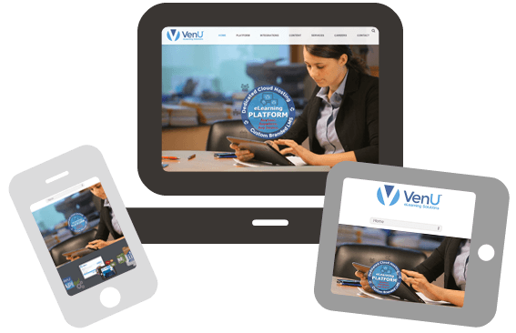
Today VenU™ released its new corporate website to announce the latest version of its LMS – VenU Connect™. Sporting a new “mobile first” responsive design, advanced theming and branding tools, powerful web services, advanced reporting capabilities, social networking and gamification tools – VenU Connect™ incorporates the latest technologies in eLearning. With user experience a top priority, we understand that elearning initiatives are meant to engage and interact with users in a way that eliminates the hassles of typical compatibility issues while providing an innovative and enjoyable experience.
Check out our new website for an in-depth look at what elearning should and can be!